Principle
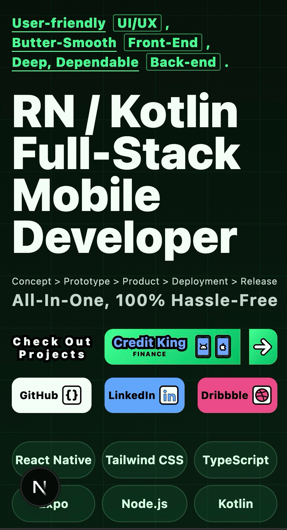
Credit King is a React Native finance UI system shaped around dashboard clarity, Expo Router navigation, TypeScript structure, SVG assets, animation, and Figma translation workflows.
UI/UX Philosophy
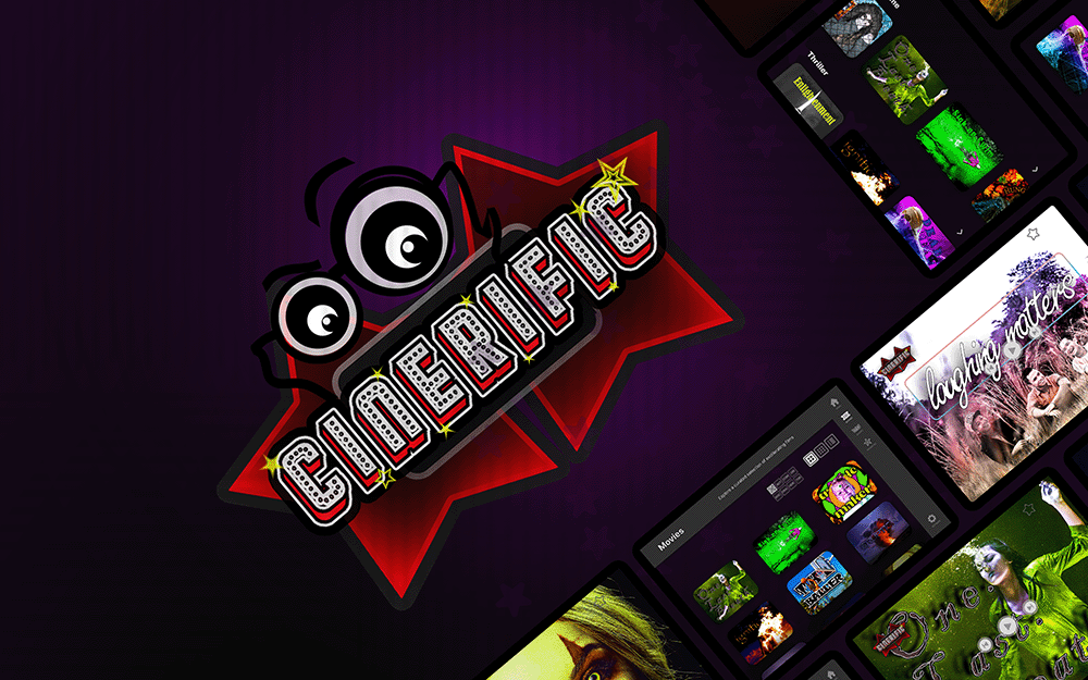
Cinerific is a Kotlin and Jetpack Compose entertainment prototype, turning Figma concepts into tablet-ready onboarding, sign-in flows, drawable assets, and motion foundations for streaming identity.
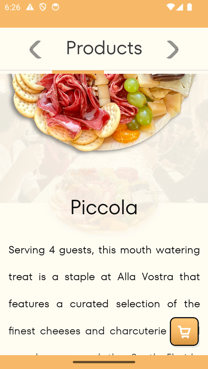
Alla Vostra is a React Native and Expo commerce product connecting Stripe checkout, Postmark emails, order states, Android UAT, EAS builds, and release-ready mobile polish.

Credit King is a React Native finance UI system shaped around dashboard clarity, Expo Router navigation, TypeScript structure, SVG assets, animation, and Figma translation workflows.
This Portfolio Website is a responsive Prahl.dev showcase built using Next.js, React, TypeScript, Tailwind CSS, motion-ready patterns, Lucide icons, custom assets, and static export deployment.
Cinerific is a Kotlin and Jetpack Compose entertainment prototype, turning Figma concepts into tablet-ready onboarding, sign-in flows, drawable assets, and motion foundations for streaming identity.
Alla Vostra is a React Native and Expo commerce product connecting Stripe checkout, Postmark emails, order states, Android UAT, EAS builds, and release-ready mobile polish.
Credit King is a React Native finance UI system shaped around dashboard clarity, Expo Router navigation, TypeScript structure, SVG assets, animation, and Figma translation workflows.
This Portfolio Website is a responsive Prahl.dev showcase built using Next.js, React, TypeScript, Tailwind CSS, motion-ready patterns, Lucide icons, custom assets, and static export deployment.
Cinerific is a Kotlin and Jetpack Compose entertainment prototype, turning Figma concepts into tablet-ready onboarding, sign-in flows, drawable assets, and motion foundations for streaming identity.
Alla Vostra is a React Native and Expo commerce product connecting Stripe checkout, Postmark emails, order states, Android UAT, EAS builds, and release-ready mobile polish.
Credit King is a React Native finance UI system shaped around dashboard clarity, Expo Router navigation, TypeScript structure, SVG assets, animation, and Figma translation workflows.
This Portfolio Website is a responsive Prahl.dev showcase built using Next.js, React, TypeScript, Tailwind CSS, motion-ready patterns, Lucide icons, custom assets, and static export deployment.
Art & Design / Psych / Pers. Dev. - Short - Gaming
SMALLER, less pronounced buttons for: Sayings/meanings/culture/definition/authors
DREAM ON:
Increase Creative Input by Leveraging Divergent Thinking
Imagine yourself in a room, noone or nothing else to keep you company but a plain ol' paperclip. Your task: Coming up with as many, however outlandish, ways of making practical use of it, as long as there's even a far-fetched possibility that it might work. Feeling inspired? Unfortunately, you don't have much of a choice as the countdown is drawing ever closer:
Ready. Set. Go!
This, in a nutshell, is how psychological reaearchers study the human capacity for creativity, or, as academics themselves refer to to it: DIVERGENT THINKING.
Although the concept neither can, nor should, be expected to carry the term solely on its own shoulders, it is - undubitably, in fact - a key prerequisite for its occurrence.
After all, it is hard to come up with creative ideas that are practically useful (usefulness comprising a central criterium) if there is not, at bare minimum, the generation of presently unorthodox, and previously inconceivable or untested, solutions.
What's even more interesting, though, is that contrary to the widely accepted truism that one should 'wait for the perfect idea' when the proverbial well of inspiration dries up, empirical testing of DIVERGENT THINKING shows the exact opposite:
When out of ideas, or - worse yet - simply internalizing doubts about one's own ability for creative output, the best way of restoring personal confidence and idea generation is simply to press on, lethargy and pessimism notwithstanding.
How do we know?
Because no matter whether a test subject is asked to come up with 10 practical uses for a paperclip or 100 - stringing them together to make a rope or bungling a thousand of them together into a low-quality, but hypothetical soccer ball, just to give a few, off-the-cuff examples - the proportion of the ideas generated that may hold practical utility remain exactly the same.
That is, if 3 of the first 10 ideas conceived are deemed useful to yourself or others, an average of 30 of 100 ideas will be, assuming that you - the visionary - keep your chin up and refuse to throw in the towel at least a little bit longer.
In conceiving and actually designing the logo and main character for the video game 'Northwald' - featured above - I, like many others before me, spun my artistic wheels in the mud for literal hours trying to come up with the right character design, typography, and color theme. Then: A breakthrough.
On the cusp of giving up, I began drawing the first thing that came into my mind: and cute, anthropomorphic plushy whose towering title just so happens to draw inspiration for Norse mythology.
Was it the expected solution for my long-lingering canondrum? No.
Did it materialize as quickly as you expect your run-of-the-mill Illustrator design to materialize? Once again, no.
But dang, was it worth it once things clicked and something, somehow, possessed me to bring about its incarnation.
"Out of creative ideas," you say?
It's certainly possible, assuming that your supposed lack of creativity stems from the complete emaciation thay results from many hours of physical or mental overexertion.
You know, the kind of situation where you're so fatigued that you wouldn't make a sandwich or pick up the phone even if your life depended on it.
But in your average scenario?
Something serious is amiss, and it sure ain't the almost invariable, ever-present human capacity for generating novel and useful ideas - you know, the psychological linchpin that constitutes the be-all, end-all of creative output taking place.
Put that in your pipe and smoke it, why don'tcha.
In a 2013 film based on a true story, a young man is inspired to start a small business in his parents garage. It's the late 70's and the nascent technology of computers is all the rage.
Although successfully landing a large order from a local shop owner, it isn't long until Ashton Kutcher, playing the owner, hits a roadblock. Why so? Because virtually no one is interested in computers. Worse yet, few people - especially belonging to the general public - know what they're good for to begin with.
Granted, the concept of computers had been part of the common vernacular for decades. The idea of machines performing advanced calculations was nothing new. However, such machines were massive in size, obscenely expensive and extremely rudimentary compared to modern. Their lacking appeal wasn't helped by the fact that they were abhorrent to look at, and even more difficult to operate.
The lukewarm perception of anything computer related is perfectly captured in a scene where Kurcher is working his fingers to the bone attempting to find new buyers and investors. Making a million phone calls, he finally gets a hold of what might be a prospective client.
"It runs of a TV monitor," he says, pitching his new product.
"Yes, like a television set - exactly!"
Could this be it? Could this be the final payoff for all the grueling work that he and his company have put in? Not quite.
"No, I don't think you understand. It's not a TV. It's a personal computer," Kutcher retorts, audibly flustered that another client fails to understand the utility of his product. But maybe there's still hope.
"Do you own a typewriter?" he curiously inquires.
"Great! Do you use it..?"
Anticipating the client's response, it is obvious that Kutcher is already working out what to say the next. If he can pull her in with his next line, this deal is in the bag for this flesgling entrepeneur and his metry band of employees.
"Perfect. So imagine using combining your typewriter with your television set!"
But no - she's not having it. For this client, the concept of a personal computer, no oun intended, does not compute. In fact, she couldn't be any less interested, abruptly hanging up the phone.
And just like that, the whole conversation is rendered not only meaningless, but aggrevating to a Kutcher who is, before long, absolutely infuriated.
Unlike some others, he is not one to bottle up his feelings, much less take any sense of responsibility for his personal failures.
Instead, he carefully scoures his team of co-workers, sniffing out each and every one of them for someone to blame. His work is cut out for him when one of them makes a negative comment, giving him the perfect opportunity to project his rage.
"Oh, come on," he says.
"Cool your jets, man."
"Excuse you..?" Kutcher retorts, noticeably upset about the notion that anyone might have a problem with his behavior.
"You're so stressed, you know? Relax for a change."
As the conversation devolves into a full-on dispute, Kutcher is quick to flip the script on his partner, questioning his dedication to the company.
"You used to be motivated, " Kutcher says.
"I am motivated," he replies, standing his ground.
"Really? Then show me. This is a business, and I can't help you if you don't help yourself."
Seconds later, the intrigue is halted as a gold-colored sports car pulls up next to them, a suited up business man stumbling out of his car, map in hand.
Not knowing what to make of it, Kutcher and his employees give him an qually confounding look.
What's a man of that caliber doing in this, seemingly ordinary, neighborhood? And more importantly, why is his eyes traveling in their direction?
The man introduces himself as Mark. And as it turns out, he isn't lost at all. In fact, it appears he's arrives at the exact location he was looking for. But why is he there?
"You spoke to Don Valentine on the phone," Mulrony explains.
"The old VC from Atari?" Kutcher replies, starting to put the pieces together.
"Yeah, he said you called him 150 times. He practically BEGGED me to come look at your outfit here, called in a personal favor... Gentlemen, is there some place we can talk?"
Fast forward a few minutes and Kutcher, along with his team, are sitting face to face with each other at the dinner table for the moment of truth. Not only have they've landed a plausible investors. Even better, he's in the room with them, about to spill the beans on what he truly thinks of the fledgling startup.
For what feels like eons, Kutcher and his partners have been slaving away for hours on end without as much as a morsel of reward. Could this be it, the breakthrough that they've dreamed about for so long?
Given all recent setbacks, maybe it's best not too set expectations too high. After all, they've been eye to eye with promising opportunities before, only to watch it slip out of their fingers once it's time to reel in the price. Besides, getting rejected feels worse every time it happens, only cementing the already sinking feeling that maybe, perhaps maybe, this business venture isn't meant to last. Bracing themselves, anticipation is high as they wait for Dulroney to speak in a room that is, at this point, dead silent. But being the abrasive character he is, Kutcher doesn't wait for Dulroney to speak.
"So how much are we talking about here?" he impatiently inquires.
"The investment?" Durloney retorts.
"That's what you came here for, isn't it?" Kutcher continues.
"Yeah, well... I've been looking for something to really sink my teeth into."
"Look, I'm willing to take the risk, and this certainly qualifies... But risk disguised as promise, and you've shown promise. I've seen it in your eyes, and I know that looo because I've had it myself. It tells me you're onto something big."
Pausing for a moment, the room is dead silent as Kutcher and his employees hold their breath, bracing for Dulroney to make his offer.
"To the point, I think we should start with 90 grand and see where that takes us." The offer comes as an absolute shock.
$90,000? Could he be serious? Moments ago, Kutcher and his employees were bickering in the driveway of his parents on account that they can't find anyone remotely interested in shelling out a single dollar for their company. Moments later, a multimillionaire tech pioneer is openly voicing his desire to financially back the company by his accord. Wow.
But of course, nothing ever goes the way you expect with Kutcher at the helm. With him as the leader, nothing ever ends up you think it will.
Instead of taking the offer, Kutcher begins negotiating, stimulating that he will only take the deal if Dulroney kicks in $250,000 credit line with 10% interested. No worries, though, Kutcher makes clear. The loan will be paid back in full once the company becomes profitable.
Taken aback by Kutcher's reponse, Dulroney's jaw drops to the floor. He is not used to getting such an assertive counter offer. But especially, he is not used to the fact that such a young, inexperienced and absolutely nameless entrepreneur has the gaul to start making daring demands. After all, one would surmise that it is the rich successful investor in the room that owns control of the situation, not the brash youngling sitting across from him. Yet alas, it doesn't matter.
In the end, the two of them shake hands in a what has gone down in history as one of the most legendary investment deals of all time.
If it isn't clear already, the real-life character that was portrayed by Ashton Kutcher in the movie is none other than Steve Jobs, and the tech startup, on that account, was modern corporate giant Apple Computer Inc. This begs the curious question: Did the story just outlined really play out?
Well, it depends who you ask.
If you're in the tech industry like myself and voice positive views of the film, people are quick to point out that the movie JOBS (released 2013) starring Ashton Kutcher is terrible compared to film STEVE JOBS (released two years later, in 2015) wherein the titular role is played by Michael Fassbender. Indeed, one may even venture to say that displaying anything other than scorn towards JOBS (2013) is met with derision. There are 3 reasons for this.
Firstly, JOBS (2013) attempts to pack in a laundry list of life events so lengthy that it is hard to unearth any real sense of depth in any singular situation. Champions of this view believe that the delicate intricacies of Steve Jobs' true personality were overlooked for the sake of cramming in as much "action" as possible, sacrificing quality for quantity.
Secondly, there's a widespread opinion that Ashton Kutcher's acting chops are subpar and not cut out for a serious drama or psychological thriller such as JOBS (2013). According to those subscribing to this view, Kutcher is passable for starring in a silly romantic comedy (God knows he's made many of them), but simply doesn't have the gravitas to uphold two solid hours of high-brow cinema.
Thirdly - and most importantly - there is a pervasive sentiment that JOBS (2013) isn't sufficient in the factual accuracy department, misrepresenting important events surrounding the original founding and ongoing running of Apple, and, sometimes, completely fabricating things that never happened.
Indeed, Steve Wozniak (the engineer that co-founded Apple alongside Steve Jobs) has been vocal in his criticism of the film, stating that it is replete with makebelieve, particularly claming that it unrealistically glorifies the man, not just with regard to his personality (it is well-known that he was mean) but his ineptitude with spearheading the company at many turns.
No matter what side you fall on in this debate, one thing that cannot be contestant is that the vast majority of the scenes that play out in JOBS (2013) have at least a curnel of truth to them, the business investment negotiation between Jobs and Markulla being a prime example.
Fact is, most of those who put down the JOBS (2013) movie concede that Jobs really did make a 150-something calls to Don Valentine, the Vice Chairman at Atari.
Although Jobs did cut his teeth working at this legendary game company, he was regarded as an absolutely nobody by Atari executives, harboring no desire to assist financially in his (then) outrageous idea of assembling, and bring to market, a personal computer.
Instead, it was Jobs incessant nagging that forced his hand, sending Mike Markulla to visit Apple in Jobs's garage at a time when virtually no one bat as much as an eyelash at the tech startup.
On that note, it is completely true that Markulla offered to invest $90,000 in the company (taking ownership of one-third of Apple) and that Jobs requested that he accommodates them with a $250,000 loan as they desperately needed cash flow. The source?
2011's autobiographical best-seller STEVE JOBS before which author Walter Isaacson conducted hundreds of interviews with co-workers, business partners, competitors, friends, and enemies, 40 of which were personal conversations with the man himself.
STEVE JOBS (2011) is the only officially authorized biography on Steve Jobs that was ever published, and it released just two weeks after his passing. It details everything from the nastiest blemishes to the rosiest virtues about the man and is widely regarded as the most representative, all-encompassing literary work on the person who was instrumental in revolutionizing modern technology. This brings us full circle.
Althoygh it's impossible to know what Jobs' earliest sales pitches sounded like - we don't have the transcripts - it is very likely that convincing prospects about the possibilities of "combining you TV and your typewriter" really happened.
Although it's hard to imagine now, the idea that a computional device could be practically interactive, output video signals to a monitor, and be user friendly was absolute pipe dreams only a few decades ago. And although neither Jobs, nor even his co-founding partner Wozniak, truly "invented" every facet of the game-changing Apple II device, it was they who unified all of the above into one device, and - perhaps - most importantly - awakened the general public to the endless possibilities of personal computing. This has important implications for those operating in the tech industry, not leasting involving UI/UX designers.
Most products - in fact, the vast majority of them - are not going to sell themselves. Yes, Instagram is chock-full of shocking success stories involving a 18 year-old programming geniuses whose first product gained immediate traction, went viral, and conquered the world in the span of a few days. But in the vast majority of cases, efficaciously promoting the (sometimes hypothetical) utility of a product over time is what will determine its success.
You can be the most talented UI/UX designer to walk the Earth. Obviously, it makes a considerable difference. But unless you're willing to stick your head, in the words of Jobs himself, "you're not gonna get very far."
So if you're pitching an unorthodox app the likes of which has never been seen before,
It might be hard to convince the world that it holds practical value. In fact, it's guaranteed that it will be. And that feedback may come in a less-than-desirable format, rife with angry lambasting, taunting laughter, and worse.
But if it's something you truly believe in, ensuring the design's success absolutely necessitates pressing forward against all odds. And why is that?
Because no matter how hard it is to woo those around you about its value, it is not as difficult - not even remotely so, in fact - as convincing someone of "combining your TV with your typewriter."
Quartz ladder ocean velvet neon pebble sentence prism gentle circuit morning hush canvas flicker silver map
Personal Development - Religion & Spirituality - Short
Go the extra mile by designing more illustrations and putting ogether more protypes than needed, as long as your primary ones look good, function well, and confer user satisfactio as standalone-creations.
Human vice of 'Loss Aversion' makes it so that we are afraid to cut out 20%-40% material in dismay that that they were a waste of time., because discarding or, rather, ommitting materials indicates time wasting or quality compromise. But remember Shigeru Miyamoto when he, onced interviewed about his video game development mentality, espoused, "Nothing ever HAS to go into a game."
Even if it's good, that possibility is irrelevant if it's a fractured component intermingling with a cornucopia of other design assets, together making up one cohesive, satisfying whole.
In the following graphic design (USE EXAMPLE), there's a dozen or so visual objects that I conceived and later materialized into actual illustrator assets after spending 1-2 hours designing eachbassets. Wanna guess how many of those assets I ended up actuslly using for the project in question? 3 of them - that's a (seemingly) staggering attrition rate of 75%(!).
Still feeling bad about that one half-assed, two-layered dashboard Figma icon you just eliminated from your prototype file, leaving it on the cutting room? Please don't.
Whether you're inclined to believe it or, the vast majority of your un-used assets will have their phoenix-rising moments, either repurposed in their initial form, or, some of them require just a tad bit of touching upb tweaking before successfully included in a future project farther down the line.
And the rest? Well, they won't be seeing the light of day any time soon. However, that doesn't remove them from acting as an excellent cautionary tale that you can look back on in a few months or years when you're older and wiser than ever making such an aweful design again.
More importantly, perhaps, it will, unless you have some form of cognitive amnesia that you haven't informed me about, be a purely educational lesson that you've learned from designing then en route to becoming the excellent designer that you're actively towards becoming.
Or, an old Buddhist proverb,, wisely proclaims:
"Don't worry what dirction you're going, as long as every step you take is in the right direction."
4 - Design - Film
CAPTIVATE
Ensure Control by Keeping Attention Over Time
"Are you not entertained?!"
So reads an iconic line from the blockbuster GLADIATOR. In the 2002 film, Maximus Marcus Meridius, a disgraced Roman general played by Russell Crowe, is enslaved. Brought to the Collosseum, he is ascribed the role of gladiator and pitted against other warriors as they fight to the death. The purpose?
Entertaining the masses present by adding some well-needed entertainment to their lives, and - if my recollection of college history class serves me right - keep them distracted from the Caesar's abhorrent mismanagement of the empire.
As most every Roman emperor knew full well, a hearty provision of "bread and circuses" was the absolute lifeblood upon which the maintainance and growth empire depended, perhaps one of the reasons why this might civilization was able to sustain itself for more than half a millennium. But let's not get off track.
When Meridius emphatically projects his sarcastic rhetorical question at the blood-thirsty audience cheering him on in the stands, and, more importantly, at the agents in charge of holding him captive, he doesn't do so immediately upon entering the arena.
Quite conversely, he has already (however reluctantly) slaughtered more than a handful of blood-lusting warriors pitted against him at the show floor.
Only then, once he feels that he has proven his worthiness as a warrior, and hence - by extension - of reclaiming emancipation, does he begin to suggest that they should let him go.
Now, let's fast forward a good thousand years or so, putting this into a context, and into relevancy, of UI/UX.
We've talked already about the value of attraction; that is, the value of making a great first impression. But this begs one inescapable question:
What's the point of making a splash big enough to grab the user's interest if you can't stay afloat long enough to convert that interest into being captivated over time.
Unless the UI/UX project you're working on is so extremely simple that everything can be crammed onto a single screen (sometimes, even that, insufficient reason) you need a game plan that keeps the user perusing the text, navigating the menus, or actively utilizing the functionality, of your app.
Dealt a hand of visual minimalism? Put more thought into font size, weight, and type, allignment, etc. - assuming you have text to work with.
Client riding you about overcomplicating your prototype with too many pages or screens? Cut down on their frequency, and, if necessary - bake more content or functionality into each entry by hiding or compressing some of it (reference article "BE COMPLEX - Utilize Possibility Space").
Would you drive to your local movie theater and shell out fifty bucks for a ticket and snacks only to hit the exits ten minutes before the ending?
If the answer is no, don't make the user do the same when they visit the app or website you designed.
Charming their pants off at first gaze might sometimes, but doesn't always, keep them around as long as your own wishful thinking will lead you to believe.
VP #5 - Design - Psych / Bio / Math /
BE (ALMOST) SYMMETRICAL / KEEP IT EVEN-STEVEN
Increase Visual Appeal by Ensuring Symmetry...
Evidence that people are more sexually attracted to physically symmetrical partners
Geometrical Principles from the Golden Ratio.
If I ask you to guess what the most attractive facial feature is in the opposite sex based on actual research, what would be your answer?
If you're a man, the answer you just gave might include "soft lips" or "good skin." If you're a woman, your answer might have been something akin to a "manly nose," "straight eyebrows," or - a classic favorite among females - "strong cheek bones." So, which is it?
Funnily enough, the correct answer is neither of the above.
To get a better understanding of this, direct your gaze to the two drawings above where the answer to what woman is more physically attractive should be no contest.
One (left) is good-looking according to what men claim is attractive in their own words. The other (right) is "moderately" good-looking (whatever that means) based on what men say they prefer a woman to look like, but with one (surprisingly) massive advantage: her features are symmetrical.
Now, be honest with yourself: Which of the two is more aesthetically appealing? Is it the "textbook beautiful" woman with moderate symmetry, or the moderately good-looking woman whose facial proportions are near-perfect based on mathematical accuracy?
If you answered the one to the right, you're not just in the majority - you're in the overwhelming majority. And no - neither you, nor your average Joe - has lost their mind in making that assessment. So, why is that?
As with so many other things in life, the reason you made the conclusion you did is because in judging what's more beautiful, it's the subconscious - not the conscious - that decides the rules according to which the game is played. And because the human mind just so happens to put more stock into deep-rooted mathematical symmetry than superficial visuals, it's the former that wins out.
Had it been the case that this uncanny discovery is exclusively confined to how someone looks and the way they are perceived based on it, this observation quite frankly wouldn't matter much.
But because the phenomenon is highly applicable to other forms of art, including - you guessed it, UI/UX design - you're in luck; it does matter, and can, in fact, be absolutely pivotal.
If you're designing a screen for a mobile app that features a dashboard with horizontal margins of 8 pixels on each side, don't randomly divert from using that pixel count on your vertical margins.
And if you DO need them to be smaller or larger, please - for the love of God - do not make them 3 or 7 pixels. Instead, make your measurement on that is evenly divisible or multipliable, such as 2, 4 or 16 - I think you catch my drift.
In your own conscious mind, it might not make that much of a difference. But in the subconscious mind of your user - you know, the part of the mind that truly decides whether someone likes or dislikes what they're experiencing - it does.
Oh, and one more thing: utilizing mathematival symmetry and proportions in your UI/UX designs isn't just a surefire way to ensure pretty aesthetics.
It's also a way to ensure the development team you're working with won't want to strangle you once you hand over a project file that - albeit replete many good ideas - can't be converted into practically useful code.
HURRY/RUSH/GET TO THE POINT
Ensure Brevity to Safeguard Against User Disengagement & Alienation (don't make the animation too long) print
The notion that it's human nature to be impatient isn't an opinion - it's fact. Since time immemorial, it has been the case that people watching, listening to, or interacting with something, won't stick around for long. But it gets worse.
Once you add modern lifestyles & technology to the mix, well... You better get right to the point - and that's pronto. I can think of few cases where this is more true than UI/UX design, and - more specifically - animation.
When putting together an animation - even an in-app infographic - you aren't even afforded the luxury of working with a brief timespan of seconds - you're working with microseconds.
You know that character you were planning to slide into view from off-screen over 1 second? Cut it down to 500 milliseconds.
Remember the way you envisioned them boisterously waving their arms at the user over 600 milliseconds? Slice it to a grand total of 300 milliseconds.
Yes, you might be compromising the visual potential of the work itself. But you've got to remember - there's no inherent value to the creation you've spawned. Instead, what constitutes appropriate duration hinges completely on the venue wherein the animation is to be included.
If you're designing an animatic for a film, oral presentation, or the like, it might be a good idea to make your animation span 2 seconds - heck, you might even have 5 or 10 seconds to work with.
But if the animatic is serving the purpose of spicing up the act of transitioning between screens or denoting the user on the successful completion of a app-related task, you need to be real with yourself.
Albeit your animatic may be both eye-catching and entertaining the first time the user's seen it, what about the tenth or hundredth time it hits them? Exactly - the charm has worn off.
There are exceptions to the rule, of course.
If the animation appears on a loading screen that genuinely requires several seconds to complete a complex back-end operation (probably few and far between) a drawn out animatic is fair game. As a matter of fact, it may even be preferable. After all, we don't want the user staring into the empty abyss, now do we?
Again, the point here is not to point fingers at poorly purposed animation. Rather, it's simply an appeal to common sense.
For an animation to qualify as truly great, it can't just be appealing to look at - it needs to fit into the user experience in which it is used.
IP #1 - Personal Dev / Psych / Literature -
CHANGE YOUR SHOES / TRADE PLACES / ENVISION IGNORANCE
Accommodate for Ignorance by Pretending You've Never Used the App Before
('Break(destroy)/Lift(cease) the Curse of Knowledge')
In the ultimate user experience that we like to call life, houses, like cars, are the bomb if or when you're able to afford one. But would you lock in that dreamy Spanish villa without booking a tour, or buy that sleek-looking Toyota, however dependable, without taking it for a brief spin?
No, you wouldn't - and the same goes, or at least should, for designing a UI/UX that lasts throughout the ages. That is, not only should you be testing your own creation (da?!) - you should simulate using it as of holding no prior knowledge of it, and, essentially, using it for the very first time.
Perhaps, the reason why not every UI/designer does is that unlike the house and car, you're the (supposed) beneficiary GETTING PAID for during app development as opposed to being the one PAYING for it. Makes sense, right?
Oh, what a fallacy.
Had you thought more deeply on the matter, chances are you would have realized that working towards a paid project for a client can be more costly than being the client themselves. How so?
Because time is money too, you big silly goose.
But instead of launching into a tedious diatribe about the behavioral economics term OPPORTUNITY COST that few remember for anything other than its uncanny ability to making those uttering the term instantly forget all about it, consider this:
Maybe, just maybe, being the most knowledgeable person in the world about the UI/UX design you personally concocted from start to finish, in fact, makes you the worst judge there is with regard to objectively assessing what is truly good and bad about it.
But don't take my word for it - especially bot when there are esteemed Harvard psychologists and best-selling authors such as Stephen Pinker echoing identical sentiments.
According to Pinker, the CURSE OF KNOWLEDGE - that is, the counterintuitive human tendency to perform worse on a task simply because one harbors knowledge about it - is a problem in many facets of life, not least including writing.
When a writer picks up a pen to compose a piece of literature - assuming they are one of the few using such a primitive tool these days - they are, consciously or not, anticipating what the reader is thinking or feeling about every word, sentence and paragraph.
The only problem - and yes it is a problem - is that many, if not most, writers fail to properly anticipate what the reader is thinking, and, consequently, fail to accommodate for them in their writing.
For instance, they may not realize that the reader is growing tired of flowery adjectives repeating the same thing over and over again when the reader got the message three pages ago, completely bypass long, chunky explanations of complex concepts where desperately needed, and so on.
In the context of UI/UX design, the equivalent of such traps might be exploiting the use of pop-up menus, leave them to their own devices when faced with navigating a cryptic UI that should have been more elaborate, and the like.
In the image featured, there is little to no indication of how the user can or should effectively access different types of content contained in the app.
Because of this, one might imagine, the user is quickly moved to boredom, confusion, or worse. How could this have been prevented?
Some seasoned UI/UX designers might advise aspiring ones to take a break for a few days or weeks (if possible) and come back to observe their creation with 'new eyes.'
Others might recommend 'focus grouping' the design by consulting family, friends, and - better yet - strangers about their genuine opinion on the design.
The worst possible way to handle the situation?
Sticking your head in the sand, pretending everything is honkey dory, and watching helplessly (but predictably) as the development staff and project manager tear your meticulous design to pieces, effectively illegitimating days of hard work that could have generated actual, non-disposable productivity.
I've done it. Your co-workers have done it. Heck, even your boss has probably done it in their formative/up-and-coming years.
If you haven't, give your all to keep it that way.
VP #3 - Pers. Dev. & Self-help
BE OPEN-MINDED / RELINQUISH CONTROL
Let Your Design Concept Guide You In Unexpected Directions By Exercising Mental Flexibility
Let's conduct a thought experiment. You've been assigned a graphic-heavy UI/UX project. At first, you tell yourself you're fine sticking to Figma even for your visual artwork. But as time progresses, you realize something: the posterchild of immaculate UI/UX design known as Figma might be more than enough to design your mockups, wireframes, & flow, but isn't gonna cut the mustard in developing some more intricate visual. What do you do?
Assuming you haven't completely lost your marbles, the easy answer should be this: You utilize Illustrator/Photoshop in order to make your client's vision, however ghastly, more achievable. The only problem - and isn't exactly a minor one - is that while this greatly enables you to make your vision a reality, it doesn't solve an even more fundamental, and probably more frequent, problem, namely coming up with what to design in the first place. Luckily, there's a trick you - at least in the early, conceptual stage - can make great use of. Allow me to demonstrate.
The picture above shows each evolutionary stage of a video game character design, from its basic shape, to its intermediate form, to its completed version. Now, be honest with me.
If you centered your eyes squarely on the first illustration (left), where would you image anticipate that the round-shaped, yellow design is going? A ball? A sun? A combination of the two? Think again.
Although it's tempting to follow the beaten path of well-established graphic design orthodoxy, what if you did the absolute opposite? For example, what if you decided to mold the circular object initially conveived not into an inanimate entity such as a ball or sun, but as far away as you can get from that original idea?
In the age-old American comic strip known as Calvin and Hobbes (assuming that a cartoon from the 80s and 90s qualify as such), Calvin invents a rule-based game with one convenient caveat: the rules are different every time the game is played. Because of how well this principle translates to a vast range of human endeavors, and how immensely applicable it is, (comic fan) academics have coined a term for it: The Calvinball Effect.
The point of this is neither to discuss comic strips, or even - actually - to ponder cartoony illustration. Instead, it's simply to underscore that, once the moment of the graphic designer equivalent of writer's block sets in - and, arguably, even before the stage of hopeless malaise is reached - try something different. And you know what? Sometimes, DIFFERENT may consist of doing the straight OPPOSITE of what others, or you yourself, expect.
Now, back to the design in question.
Since the yellow, circular blob dotted up (left) is inanimate, we are going to transform it into a living, breathing being. But how? Well, think of something - fictional or alive - that fits the bill. In this case, I decided to use my imagination to come up with a "living" entity that could, at least hypothetically, pass for round and yellow, since few real-life human beings or animals will. The result?
A cute, plush-like toy with stubby hands and feet, big, adorable eyes and a lively mouth (center). So we're done, right?
Nope!
One of the best things about employing the CALVINBALL EFFECT towards our designs is that we can often make use of it multiple times.
So far, we have taken the inanimate, yellow ball-shaped object (left) and made it into a (however non-existent) cute plushy (center). Now, how can we take the most conspicuous feature of that illustration and turn that creation and subvert expectations once again?
Since we've already gone the route of making something inanimate (left), we can't capitalize on that particular quality when we consider what to do with our cute, living creature. So instead, let's exploit the fact that the character is CUTE, and gravitate as far as we can as we jot up the third and final version of our character (right).
That right - we're making our (supposedly) innocent character into a violent warrior. In fact, let's be even more specific and morph the plush-like toy into a cold-blooded viking, axe and all!
Slap a descriptive, unique and memorable title above its head, and BOOM! We've got ourselves a video game title screen that - if I'm shameless enough to congratulate myself - looks pretty darn fine.
In a classic episode of the 90s sitcom Seinfeld (does it even need an explanation?), the neurotic and insecure George Costanza discovers that he can pick up most every woman he wants while brutally honest about the fact that he's unemployed and lives at home with his mother - you know, the straight opposite of what he would usually do. How so?
By exuding confidence in his delivery.
Although I wouldn't recommend approaching your greatest crush with an endless barrage of self-depricating remarks, the truth contained in the basic message of this counterintuitive method conduct still stands: if you believe in yourself, others will too.
If you can combine unshakable self-confidence with an unwavering willingness to exercise conceptual flexibility throughout every stage of development as your visual design progresses, then...
You aren't just golden. You're absolutely unstoppable.
C #1 - Phil / Hist
PRIORITIZE
Ocam's Razor - Effectivize troubleshooting by considering, and addressing, the simplest of potential problems first
Entia non sunt multiplicanda praeter necessitatem. Nonne recte dico?
Oh, I'm sorry. I forgot you're not fluent in (virtually) extinct, ancient languages, the one in question being Latin. But alas, I forgive you, mostly because... Well, neither do I - the exception being that short, but impactful phrase. So here's the translation:
"Entities must not be multiplied beyond necessity." Meaning? If given the choice between a simple and complicated explanation or solution, opt for simplicity. Author? The 14th century English Franciscan Friar William of Ockham.
Although few know him by name, many people - especially academics of various fields, still to this day - understand, and actively recite, the gist of what he said, calling it, among other things, 'Occam's Razor.'
Although Occam wasn't completely original in coming up with the principle commonly ascribed to him (he built upon, or - if you prefer - mooched on established ideas established before he was even born), that's not important.
What IS important is what he believed and disseminated in his teachings, which is highly applicable to UI/UX. As you might have noticed by now, this book isn't exactly short on advice pertaining to prototyping and graphic design. An area in which it has, however, been sorely lacking thus far, is that of programming. So let's remedy that problem in one fell swoop, shall we?
As anyone who's taken even a surface-level stab at programming - front-end or back-end notwithstanding - has surely noticed, making honest mistakes - and setting out to fix them - is far and away the best way to learn and improve. But how do you know where to focus your attention?
Although programming languages such as HTML and JavaScript often have little in common - rightfully so! - the overarching way to work out an unexpected kink is usually the same: Consider the simplest possible explanation for your problem first, NOT the other way around.
Example: You're tasked with designing a web app that showcases a selection of residential properties. You're using HTML, CSS, JavaScript, and React.js to accomplish this.
Because of time constraints, you make the fatal mistake of coding away at your own discretion without really checking for errors along the way. Before you know it, you're presiding over a landing page that, albeit mostly pretty and functional, is subject to some serious glitching. What now?
Well, Smartypants. Since you didn't check yourself before you wrecked yourself (yes, even UI/UX book authors listen to old-school hip-hop), you're going to have to make the most of a dire situation. But do not despair.
Although you might be tempted, at first instinct, that it's your React.js file that's tripping things up, it's much more likely that your HTML file is the source from which your problem springs. And sure enough, that's exacrly what happened here.
Because of something as ridiculously simple as a poorly constructed div, your React.js code got confused, misdirecting where to utilize code. The result? It took an irksome five MINUTES to remedy, as opposed to an infuriating five HOURS(!).
If you're managed to remain spared from the likes of the aforementioned scenario, it's possible you're just one lucky goose with near-astronomical luck. Far more likely, however, is that you either:
a.) Are brand new to the game of front end app development, or
b.) Have no interest in learning how to code (exclusively focusing on UI/UX design via prototyping and graphic design - that's fine too!)
If you do harbor programming aspirations of any kind, however, you're more than a little advised to take a lesson from Occam's timeless problem-solving approach.
And remember, at the end of the day, you aren't even doing it for some bowl-cut monk from the Middle ages.
You're doing it for you.
A #2 - Design
BE HYPERBOLIC/EXAGGERATE
Ensure Engagement by Making (Some) Visual Attributes Larger or More Pronounced/Conspicuous
Planet Earth is quite the magical place, isn't it? The fauna of nature; the multi-facetedness of the animal kingdom; and, last but not the least, and diversity of cultures.
Let's talk about the latter, though.
Unfortunately, the fact that a great deal of variability exists BETWEEN cultures doesn't mean that variability exists WITHIN them; that is, human beings being different from one another - at least not if we are to believe the norms and values, openly or unspokenly, taught to the individual in many sociocultural settings.
In the United States, it is taken for granted that everyone should lead a life of expressing and pursuing their individual wants and needs - even at the shagrin of the collective (as long as you don't hurt yourself or others, of course).
But as anyone that's been around the world once or twice has surely noted, such is not the case in many corners of the globe. In Japan, people are taught that "the nail that stands out is the one that gets the hammer," outright teaching people that standing out is detrimental.
Even in many parts of the English-speaking world, the TALLY POPPY SYNDROME (an agricultural analogy where the tallest flower is the one that that tastes the scythe during harvest) less directly, yet oh so clearly, that it's better to go with the crowd than carving your own path.
So, what does this have to do with UI/UX design? I'm glad you asked, as it is highly pertinent of some of its facets - including graphic design.
When designing an illustration - let's say, for the moment being, an anthropomorphic animal character - it's easy to get stuck in TUNNEL VISION.
Interestingly, I'm not referring to the notion that you've let a client's wishes dictate, in minute detail, how to design your illustration and end up with something so painfully cookiecutter-esque that neither you, nor the client, is satisfied with it.
In fact, I'm not even referring to carefully molding your own unique vision before you - because the original idea was so tantalizing, or because you've sunk so many hours into it - put wishful thinking over objective reality, ending up with an ineffectual, and ultimately useless, design.
Even more fundamentally, any work of graphic art - unless viewable exclusively in one size, which is rarely the case - needs to look good in any proportion. That is, even if you blow it up to preposterously large levels or an infitesimally small one, it should look good.
No, it's not necessarily required that you can make out individual letters if your design involves typography, or that you can readily recognize every layer of shade of color used at first gaze.
But at bare minimum, what you're laying eyes on shouldn't look unfinished, cluttered, or - worse yet - ugly.
If you're willing to indulge me, fix your eyes on the illustration to your left WITHOUT gazing on its rightside counterpart (you're not some no-good, dirty cheater, are you?).
You've got a logo with some good coloring, some well thought-out typography - the whole nine yards, am I right?
Ok - now look to your right. Although the logo works well in both its intended size AND blown up by a factor of x2, the small one leaves a lot to be desired.
First of all, it looks messy because there's too many shapes interacting. Secondly, there's too many color shades prresent, cannibalizing each other. And as if that wasn't enough, the size of the font is not proportional with the rest of the logo's design.
The moral of the story is as follows:
When it comes to the social and culture behaviors you adhere to based on where you come of age, be my guest and do exactly as you please. It's none or my business what you think or feel, nor is it anyone else's.
But if you're taking on a UI/UX design project - especially one involving graphic design - it is paramount that you leave any semblance of conformity you've accrued at the door.
Only then can you come anywhere close to your potential - and create something truly great along the way.
#33 (???) - REMAIN HUMBLE / INHERIT THE EARTH -
Interactive Prototyping, Visual Prototyping, Graphic Design, Animation & Coding - Personal Development / Math & Physics / Religion & Theology - Long - Media
------
NO PICTURE
-------
In 2008(?), astrophysicist Patrik Norquist participated in a part-comedy, part-talk show in his native country of Sweden. At first, nothing out of the ordinary was at play.
In typical fashion, two hilarious, but charismatic hosts, laid out the programming schedule for the remainder of the show; an already excited crowd built up their already palpable anticipation to ever greater heights; and last, and the central fixture of the show, a panel of five esteemed subject matters experts, were sporadically consulted by the hosts about their knowledge on various intellectual subjects, often erupting in audible audience laughter and applause as the academics sat back and soaked in their fleeting time in the limelight of the mainstream. Norquist was one of those academics - and for good reason.
By this point in the program - almost a dozen episodes in - he had made a name for himself as a quirky professor with avant-garde perspectives on the world, sometimes manifesting in the form of humorous comments, other times culminating in foolhardy science experience, such as blowing things up by facilitating chemical reactions of various kinds. Without exception, though, Norquist had a point with every things he said and did, as evidenced by the striking declaration he was about to put forth.
Taking the stage - or, at least, absorbing the attention of every onlooker in the corner of the student where he sat - Norquist began voicing a pet peeve that he, from the look of it, appeared to have been incubating for quite some time. You know - one of those things that is so obvious it isn't even talked about among professionals within a certain field (in this case physics), yet non-experts are utterly oblivious about.
The tiny insect known as the ant, Norquist explained, is strong enough to lift and carry objects approximately 8,000 times heavier than itself in its natural anatomical dimensions of 1x1 centimeter (feel free to look this up). However, when inflated to 1 meter (1,000cm), which is an increase in size by a factor of no less than one million, its purported strength would absolutely crumble. How come?
The problem of growing 1 million times in size, is that one would now have to contend with withstanding the grueling pressure of 1,000 times the gravitational pull to the ground.
The drastic increase in gravity, in itself, may not be that big of a deal if it wasn't for the fact that the ant's proportionally small arms and legs - albeit growing in tandem with the rest of the ant's body upon inflation - would not be adapted to its new, enormous size. Compared to the rest of its anatomy, they would be puny. The result?
The ant would now be able to lift and carry objects - not 800, not 80, but 8 times its weight - a far cry from its former, almost supernatural strength of 1000 times that amount.
If we assume an original body weight of 5mg - quite a bit ant, I might add - that means the ant, able to carry a minimum of 5mg (its body weight) x 8000 = 0.04kg in its natural form, can now only carry 5mg x 1000 x 1000 x 8 = 40kg.
That's right - the formerly super-strength ant, once human-sized, wouldn't even be able to muster the load contained in a single-handed dumbbell used by a professional human bodybuilder during a lax session of resistance training.
The point here is not to put down the miraculous (relative!) strength of our distant cousins in the animal kingdom, nor to massage the egos of bodybuilders. Instead, it is simply to offer a sobering reminder about the following:
Don't ever consider things - even your most fundamental assumptions about how the world works to be anything less than tentative - a principle that, luckily enough, far exceeds the scope of physics.
Since the subject at hand is app development, consider an example of why it's crucial to maintain humility about the unknown - and sometimes assumed-to-be known - but as a person actively tasked with crafting tomorrow's next big hit: changing market conditions.
In 2003, MySpace, the first truly widespread social media platform, was founded by a lone programmer with a crazy idea. In the years following its inception, the online service ballooned into a powerhouse that constituted an online pastime, if not a personal sanctuary, for virtually every American teenager.
Had there been a way to travel back to 2006-2007, I'm willing to bet that few individuals would have been open to staking more than a measly fiver on the possibility that MySpace would be subjected to competition, much less significantly outrivaled. But fast forward no more than a couple of years, and it had - in fact - completely obsolete.
By the late 00's and early 10's, Facebook had come to town with its far more appealing look, diverse functionality and clever incentive structure, demolishing any remaining sliver of hope that MySpace might, somehow and some way, make a comeback.
At this junction, anyone that's done their research on early social media platform functionality and their development will be tempted to point out that Myspace was sold by its founding pioneering briefly upon gaining traction, with a big, soulless cooperation overtaking ownership. MySpace was sold, warts and all, by its originator, separating its originator from its foundational vision forever more, and, some may surmise, making it dead on arrival. And if the lessons learned from other promising startup companies that nosedived immediately after its over takers put their grubby hands on them, it isn't outside the realm of possibility that you'd be absolutely correct.
But alas, that's missing the point.
The takeaway here is not to place blame on whoever precipitated MySpace's fall from glory, or even the underlying mechanisms that caused its abrupt downfall.
Instead, it's the fact that nothing in front-end development is exempt from the risk (and potentially opportunity) of change - the only exception, funnily enough, being change itself.
Returning to the success story of Facebook, the proof is already in the pudding. It didn't take much more than a few years for that entity to itself be overshadowed by the aesthetically attractive and clever-functioning concoction better known as Instagram (today owned by Meta, Facebook's parent company). And before you say it, yes - Instagram will, somehow and at some point in future - be forced to throw in the towel as a result of daunting competition from some kind of social user experience that may, quite possibly, be gaining traction in the proverbial underground scene of fledgling social media platforms.
Now, in order to dedramatize the pessimistic, if not bleak, prospect of future misfortunes that may or not befall many current tech giants in the years to come, allow me to use the most humorous repertoire of analogies at my disposal to convey the message of Facebook's fate (no pun intended) in a more, let's say, useful way.
In the sphere of app development, just as in the culinary parable of life, absolutely everything should be on the potential chopping block. And if you can't handle the prospect that your app won't be maintain its esteemed position as king of the hill for all eternity, then... Maybe you shouldn't even be in the kitchen to begin with.
Granted, it is true that having too many chefs can spoil the stew, each chef in this case being a honestly deep-thinking and self-critical idea you're willing to use in order to course correct under constantly changing market conditions.
But if you're dead set on declaring that any idea originating from the camp of your fiercest competitor, based solely on first impressions or years of closed-minded conditioning, will forever be unpalatable to yourself and others, then...
The end user of your product is who will bear the brunt of that rigid mindset, leaving them with a sour, and possibly indigestible, chunk to process as they ponder, helplessly, why the app that they so looked forward to using is, in fact, about as satisfying and useful as a piece of day-old, half-eaten toast.
Lesson: As a developer, try to foster and maintain a sense humility, not just with regard to how you carry yourself in the social context of the outside world, but - perhaps more importantly - in how you conduct yourself on the inside. It is what you harbor on the inside that will, inevitably in fact, be instilled into your product, and - consequently - be extended to the user.
And with that said, let's wrap this up from a point originating from a place none other than the Book of Truth itself.
In Matthew 5:5 of the Bible, it is said that, "blessed are the meek, for they will inherit the Earth." But what does that even mean?
The way the English language has come to be used in our modern day, MEEK instantly connotes a descriptive word for someone who is weak and timid. You know - someone who is wishy-washy, can't take charge, or is afraid to take on roles of leadership. But if you think this has anything whatsoever to do with the way the term was originally used - think again.
Quite the contrary, MEEKNESS used to reference the quality of being gentle and humble. That's right, it was upheld as something positive and desirable. At least in the way it was worded in holy scripture, MEENESS was something downright virtuous, and hence the state of being MEEK, one might say, a flattering compliment.
Once you internalize this semantic reconceptualization - the notion that a passive bystander mentality can, at least sometimes, be equated with actual humility - and you're able to place a life-long premium on exactly that, only the sky's the limit, in life as in app development.
Seeing as we have, by fitting coincidence, just evoked spiritual imagery, those fortunate to be more theologically inclined than myself may even choose to call 'sky' by a term that is even more familiar: Heaven. "Heavenly app development" - I like the sound of that.
Now if you excuse me - I'm taking that baby to the copyright office before someone else gets the whiff of it. Someone like, I don't know... A vigilant, resourceful reader that takes the idea and runs with it before the obsessive developer from whom it was stolen gets his obsessive hands off his keyboard. Oh, what do you know? - there is here now. Walking past my window. Crossing the street. Rounding the corner onto Commercial Avenue. Walking into the copyright office..?
Oops.
You snooze, you lose, I suppose.
Maybe he's launching the next Instagram.
Velvet signal meadow rhythm copper pixel lantern orbit silent hinge marble echo button cloud river bloom
Amber logic pencil thunder mint canyon ribbon static paper comet window texture garden spark tunnel glow
Quartz ladder ocean velvet neon pebble sentence prism gentle circuit morning hush canvas flicker silver map
Not long ago, we discussed the benefits of 'anthropomorphization' - that is, assigning human-like qualities to a non-human being (or an inanimate object, for that matter!).
But what about doing the opposite? And when would you ever need to?
Although there are several words denoting something semantically opposite, it's challenging to pin down an ideal term. Therefore, we'll be calling it 'dehumanization.'
Negative (psychological or political?) connotations aside, 'dehumanization' in this particular context would be something akin to what you're seeing in the accompanying screenshot, lifted directly from the log-in screen of "Cinerific," a media streaming app.
More specifically, I'd like to direct your attention to the avatars - 'Steve,' 'Martin,' 'Janny' and 'Guest' - at the bottom of the screen, situated right below the app's titular logo. As you may have noticed, none of the cartoony avatars - albeit clearly depicting humans - have been bestowed with actual faces.
Although this may, at first inkling, give the impression that lacking effort, or - God forbid - lacking inspiration is at play on the designer's part, the truth is the contrary. How so?
Precisely BECAUSE the avatars do not possess distinct facial features, two crucial things are ensured.
Firstly, the user is encouraged to at least partially maintain their mental focus on the 'Cinerific' logo, as they may be new to the app and it may beneficial for both the developer and user that the latter memorizes the brand name.
Secondly, the user is, while introduced to human-like figures, never once nudged into dissociating from their avatar on the grounds that it has facial features that they, in real life, do not possess.
When wanting the user to lend their attention to, or connect with, a non-human or object by instilling it with human traits, think 'anthropomorphization.'
But when you wish for the human form to be represented without coming off as too objectionably specific, consider utilizing a secret weapon that might be just as powerful, if not more so:
'Dehumanization.'
Velvet signal meadow rhythm copper pixel lantern orbit silent hinge marble echo button cloud river bloom
An infatuated female, relaxingly reclining with her eyes shut and mouth smiling as her hair billows in the wind. The catalyst:
A male - one of whom she is clearly fond - manifesting their mutual affection by leaning in to kiss her.
In an arrangement such as this one, the woman's presence is unquestionable for several reasons. For one, she's appealing to lay eyes on in purely aesthetic terms. She is, to put it bluntly, a banger to behold.
On top of that, she's aligned in the very center of the scene and appears in the foreground, so much so that she, however partially, obscures the man positioned behind her.
As if that wasn't enough, whereas she is depicted with picture-perfect clarity, he is grudgingly forced to contend with being relegated to optical bluriness, and, ostensibly, becoming a blurry recollection in the mind of the onlooker.
With these facts in hand, her role as the main protagonist should be a shoo-in, right..?
Wrong.
Although the woman gracing the title card for 'Still There' seems to have most everything going for her in demanding your attention, a glaring omission is slowly making itself known:
The relationship between visibility and memorability is not - well, at least not always - a perfect correlation. But why is that, exactly?
For one, there's a big difference between visual and psychological focal points.
Yes, the unapologetically prominent woman takes up more visual real estate. And because of this, it is she that - between her and her male counterpart - is most noticeable. He, meanwhile, is not - barely at all, actually.
But it's here that things get interesting.
Precisely because the kisser appears blurry, he becomes fodder for curiosity - once finally detected - because he offers something that the recipient of his labial likings simply does not: he's mysterious, and hence - by extension - tantalizing.
Many a time, the way in which a focal point manifests in a piece of art - and in daily life, for that matter - is by way of psychological incitement, not graphical immediacy.
Try that on for size next time someone tells you graphic design isn't a social science.
The key to making great art is often being able to appeal to the emotion of the beholder.
Yes, the man (or woman?) in the picture has their face disguised. But what are they actually feeling?
The dramatic blend of cold, dark and aggressive aesthetics in both the foreground and background clues us in on what the character is going through emotionally. But more importantly, it rubs off and moves us, the observer, as a result.
An emotion well conveyed stirs up those of the beholder.
Narcissus, one of ancient Greece's most notorious mythological figures, famously fell in love with his own appearance after laying eyes on his reflection in a pool of water. But why?
Perhaps it was because of the irresistible beauty of the human form.
The simple inclusion of a pair of 'googly eyes' is one of many ways in which an otherwise inanimate design - in the true sense of the word - can 'spring to life' by adopting human-like characteristics.
In this particular case - the logo of a video streaming platform - what used to be nothing more than a lifeless object has suddenly transformed into a character with actual feelings, which makes us connect with it not just on an aesthetic level, but on an even deeper, human one.
This is the appeal of anthropomorphization.
Is drawing on Figma underrated?
Although obviously limited in options and capabilities, it offers surprising workarounds. Since using multiple strokes (at least with different properties) is not possible, consider faking the effect by using an inner shadow as a substitute for your first stroke. Particularly, this looks nice when you can partially blend it with one of the colors on your inside gradient.
When there's a will, there's a way! 😃👍
Having more plentiful menu navigation options isn't always better, but...
Sometimes, it really is.
By placing two separate navigational menus at opposing sides of the screen, observe how the user is given a perfect overview of 10(!) app pages (5 top menu, 5 bottom menu) without ever overwhelming the user.
Top menu - 'Dashboard,' 'Debt,' 'Spending,' 'Credit,' 'Accounts'
Bottom menu - 'Home,' 'Activity,' 'News,' 'Rewards,' 'Stats'
Because of the fact that these two menus are visually seperated, the risk of putting the user off from using the app is averted and a pleasant user experience is ensured.
A lot of times, less is more. But in many other instances, it is more that is more.
With few exceptions, any website UI worth its salt should contain two fundamental element types at its core:
1. Visual elements (images, colors, etc.) 2. Textual elements (fonts, etc.)
But how do you balance the two?
Of course, you can spend day-in and day-out reading articles and watching tutorials on the topic to get a better sense of what meshes well aesthetically and what doesn't.
But at the end of the day, you have to be willing to try out dozens - if not hundreds - of visual and textual element combinations before landing exactly where you want to be.
Yes, this entails a substantial investment of time and effort on the part of you, the designer. But once you get there, you can rest easy knowing that you haven't used predetermined templates concocted by other people, or by AI.
You'll have created a fusion of images, colors and fonts that stand the test of time - all while looking completely unique. And how did you get there?
By embracing trial and error. That's how.
Do not. Ever. Under any circumstances. Leave the user hanging.
Self-evidently, it's frustrating when you're using an app - whether signing in, actively navigating its user interface, or signing out - and the dang thingamajig doesn't make clear whether it's loading, much less progressing. And yet, even seasoned veterans occasionally commit this unnecessary blunder.
When you're hitting up concert dates on a search engine, a static screen is a nuisance. When you're adding items to a shopping cart, lacking feedback aggravates. And when you're wiring money to your best friend for last night's dinner and can't tell if the transaction is stuck or pending, well...
You might as well file that under "The 7 Deadly Sins of UI Design."
I'm engaging in hyperbole, obviously. But at the same time, I'm not being the slightest bit facetious.
Nobody - and I mean absolutely nobody - in the pursuit of a goal enjoys the sensation that things are moving so slowly that they're indistinguishable from gridlock.
Luckily, there are several handy solutions.
Depending on the specific purpose of the app, the expected behavior of the user, and the individual approach of the UI designer, the solution may vary widely.
One designer may - as in the image featured - utilize a spinning wheel that revolves in a circular motion. Another designer may incorporate a loading bar that bounces right to left. Yet another designer may simply let an ensemble of colors dance across the screen to give the appearance that things are moving forward, or - at the very least - trying to.
In the end, however, the takeaway for every serious designer should be the same: Avoiding the 'sisyphic condition' at all cost.
A LARGE chunk of your user base will notice the difference. A SMALL portion of them will relish it. Absolutely NONE of your users will ever thank you for it. And yet, even that's perfectly okay once you realize you've accomplished one of the most basic - yet strangely overlooked - things with respect to developing an app from the user's point of view:
Making it essentially tolerable - and by God does that count for something.
Velvet signal meadow rhythm copper pixel lantern orbit silent hinge marble echo button cloud river bloom
Amber logic pencil thunder mint canyon ribbon static paper comet window texture garden spark tunnel glow